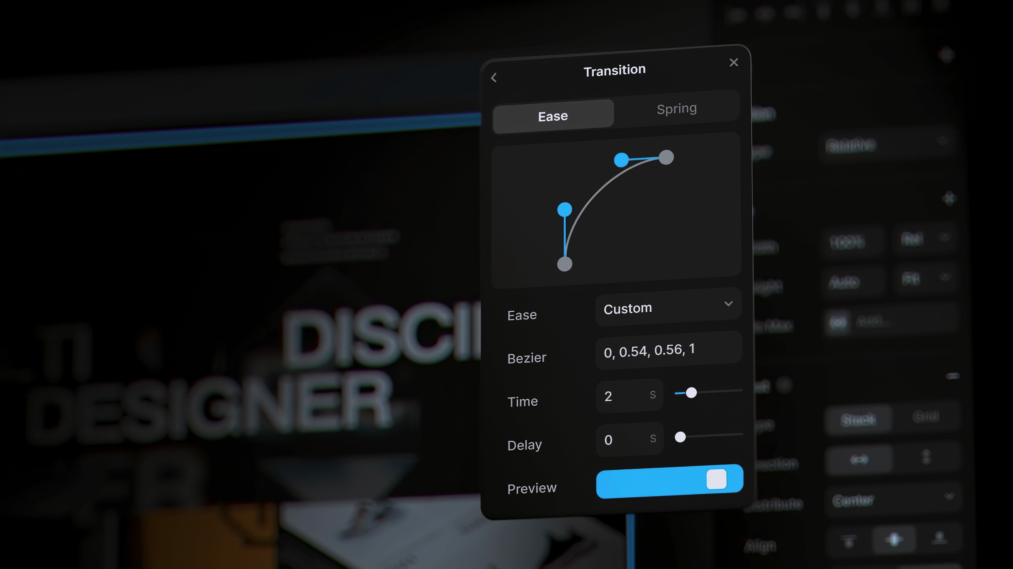
Dark mode: the edgy creative
Pros: It’s sleek, it’s modern, it’s what all the cool apps are doing. Perfect for those who like their designs with a side of mystery.
Cons: You’ve probably forgotten what a well-lit room looks like. Also, there’s a 90% chance you own a black turtleneck.
Light mode: the classic perfectionist
Pros: Clean, crisp, and timeless. Light mode users are all about clarity and order in their designs. Your grid alignment is probably impeccable.
Cons: You’re perpetually blinded when you accidentally open a dark mode app at full brightness.
The hybrid user: a designer torn between two worlds
Pros: You understand the best of both worlds—dark mode for those late-night design marathons, light mode for when you need to actually see what you’re doing.
Cons: Your settings menu looks like a battlefield where neither side truly wins.
What your choice says about you:
Dark Mode: You’re not afraid to take risks, and you probably have a secret playlist of ambient techno.
Light Mode: You value tradition, order, and you likely have a spotless desk.
Hybrid: You’re the diplomatic type, always finding a way to balance creativity with practicality.
Conclusion: Whether you’re team dark mode or light mode, the most important thing is how you use your mode of choice to create designs that shine — no matter how bright or dim your screen is. So, which side are you on?